Every element on a web page is like a box and how that box behaves is controlled by something called the CSS Box Model. Understanding this model is essential for designing layouts, spacing your content, and avoiding unexpected layout bugs.
In this guide, you will learn:
- What the box model is
- How padding, border, and margin work
- How to visualize and control the space around elements
Let’s start,
What Is the CSS Box Model?
The CSS box model describes how every HTML element is structured visually. It includes four main parts, from the inside out.
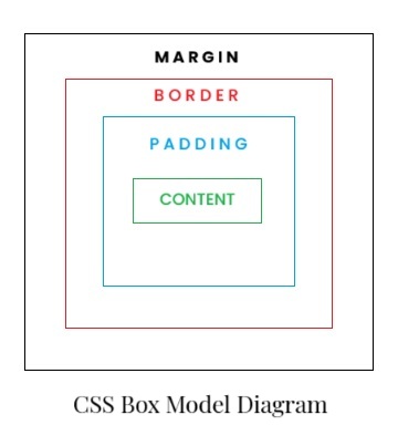
Each part adds space and can affect how elements appear and interact.
Content
This is the innermost part of the box that is your text, images, or other content.
Example HTML:
<div class="box">Hello World!</div>Example CSS:
.box {
  width: 200px;
  height: 100px;
  background-color: lightgray; /* just added for better visual understanding */
}This sets a fixed size for the content area of the element.
Padding (Inside Space)
Padding adds space inside the element, between the content and the border.
Example 1:
.box {
  padding: 20px;
}This adds 20px of inner space all around the content. It pushes the content away from the border.
You can also control each side separately:
Example 2:
.box {
  padding-top: 10px;
  padding-right: 15px;
  padding-bottom: 10px;
  padding-left: 15px;
}Border
The border wraps around the padding and content.
Example CSS:
.box {
  border: 2px solid black;
}This adds a solid black border 2px thick around the element.
You can customize the:
border-widthborder-style(solid, dashed, dotted, etc.)border-color
Margin (Outside Space)
Margin creates space outside the element, between it and other elements.
Example CSS:
.box {
  margin: 30px;
}This will push the element 30px away from surrounding elements.
Like padding, margins can also be set individually:
.box {
  margin-top: 10px;
  margin-right: 20px;
  margin-bottom: 10px;
  margin-left: 20px;
}Total Width and Height
When using padding, borders, and margins, your element’s size grows beyond just the width and height you set.
By default:
Total Width = width + left padding + right padding + left border + right borderTo avoid this, you can use:
Example CSS:
box-sizing: border-box;This includes padding and border within the defined width and height, making the layout easier to manage.
CSS Box Model Example
Example HTML:
<div class="card">This is a box</div>Example CSS:
.card {
  width: 300px;
  padding: 20px;
  border: 2px solid #333;
  margin: 40px auto;
  box-sizing: border-box;
}This creates a centered box with space inside (padding), a border, and space outside (margin), all within 300px width.
Summary
| Part | Description | Affects Size? |
|---|---|---|
| Content | Actual text or media | ✅ |
| Padding | Space inside the box | ✅ |
| Border | Visual outline around content | ✅ |
| Margin | Space between elements | ❌ (outside) |
Practice Challenge
Create a <div> styled with:
- Width: 250px
- Padding: 15px
- 2px dashed green border
- Margin: 25px auto
box-sizing: border-box
Try to guess how much total horizontal space the element takes.